Overview
Sub-du began as an assignment from a fictional “client”, and I was tasked with helping the company further develop a product in progress.
The client company is developing a desktop app that helps users keep track of their paid subscription services. They plan to expand their market reach, and needed a mobile adaptation of their desktop product for Android. They also wanted guidance with branding and asked for a style guide.
The client provided a few key wireframes of the desktop product they are currently working on, and their corporate values and target demographic to inform my decision making. The budget allocated to mobile design afforded me 90 working hours to deliver a high fidelity prototype.
- Role: UX Designer (solo)
- Responsibilities:
- Research
- Lofi + Hifi prototyping
- User testing
- Tools:
- Sketch
- Marvel
- Invision + InvisionStudio
Role: UX Designer (solo)
Timeline: 90 hours
Deliverables:
Secondary research
Lo-fi + Hi-fi prototyping
Style guide
User testing
Tools:
Sketch
Marvel
Approach
Given the 90-hour timeframe of the project, I had to devise a plan that would best meet the project goals. I made a project plan to allocate my budgeted time:
Discovery
Research plan
4 hrs
2º research
4 hrs
Survey
8 hrs
Affinity map
4 hrs
Limited time and the availability of existing solutions and their respective user reviews made these the most effective options
Design (Lo-fi)
User flows
4 hrs
Wireframes
8 hrs
Lo-fi prototype
2 hrs
Specified flows are for returning users only. Opting for only wireframes for lo-fi designs.
Validate (Lo-fi)
Write test script
1 hr
Lo-fi user testing
8 hrs
Report
4 hrs
Will use Marvel to assemble prototype for remote testing with 3-4 participants.
Design (Hi-fi)
Hi-fi screens
15 hrs
Hi-fi prototype
1 hr
Treat screens in Sketch for hi-fi mockups using UI kit.
Validate (Hi-fi)
Write test script
1 hr
Hi-fi user testing
10 hrs
Report
2 hrs
Remote testing with 3-4 new participants.
Iterate
Re-design screens
4 hrs
Use feedback from testing to update designs as needed.
Though it was a challenge to adhere to this timeline and project constraints, I was able to hand over the deliverables on time.
Research
I needed more context before I began designing, and wanted to do some research to get a better understanding of people’s subscription management habits and smartphone use. To optimize the limited time available to me, I decided to send out a survey to quickly gather information and conduct secondary research via literature review.
Secondary Research
There are a number of existing solutions that address this issue, so I decided to read user reviews online to determine which features users found beneficial and what pitfalls to avoid in my own designs.
I found that following functionalities were consistently valued (in order of priority):
- Reminder notifications of upcoming payment dates
- Visualization tools (calendar view of payment dates and breakdown of expenses)
- Currency exchange rates
- “Community” aspect that allowed users to leave ratings of services
I also found that there was a tradeoff between security and convenience with managing one’s subscription catalog. Some preferred the ease of linking a bank account to automatically detect subscription services and manage them within the app. More security-conscious users were willing to forgo auto-detection and opted for manual entry of their subscriptions.
Survey
Due to the limited timeline, I sent out a five-question survey to people within my personal network to quickly gather information. Most were smartphone-savvy millennials, which matched the company’s target demographic.
Some primary takeaways from the responses:

Insight: most participants do not actually use 100% of their paid subscription services.

Insight: most respondents enable auto-renew for subscription payment—automatic, "unconscious" monthly deductions.

Insight: the vast majority do not monitor their subscriptions at all—they cited (unreliable) memory, bank statements, and occasionally mobile notifications as their only methods of management
These findings illustrate that people are unwittingly wasteful in their subscription usage habits, and provided insight into what people's current habits and pain points were. The results strongly suggest that there is an unmet need for a centralized management tool, especially for mobile.
Design
User Flows & IA
The client provided the following user stories and product requirements, so I was able to jump right into putting together user flows to map out the basic app navigation:
As a returning user, I want to...
see all of my subscriptions in one place so that I can get a comprehensive view of my spending
unsubscribe from a service so that I can reduce needless spending
be notified if any of my subscriptions are about to be auto-renewed so that I can decide whether I want to continue the service
Here are the resulting user flows for:
- Adding a subscription
- Cancelling a subscription
- Viewing upcoming payments in calendar form
- Viewing an expense breakdown diagram
- Changing the currency unit

Now it was time to begin designing at low fidelity.
Wireframes
In the interest of time, I decided to begin with wireframes because this project did not involve a ton of ideation—the client provided the user stories and a few key wireframes for their desktop product as a reference.
Here are a handful of wireframes I came up with:


Creating these low fidelity mockups took longer than I anticipated, as this was my first time designing for Android. As an iOS user, I had to spend a good amount of time combing through the Material Design guidelines to study and familiarize myself with the components and navigation conventions.
Validation (Low Fidelity)
Now it was time to evaluate my wireframes in action. I set up an interactive prototype in Marvel and recruited three participants to conduct remote usability testing. While I would normally recruit around five participants, I chose to opt for a “leaner” round of testing with three participants in the interest of time.
In this round of testing, users were asked to complete the following tasks:
- Log in
- Cancel a service
- View their catalog of subscriptions
- Add a new subscription
- View their upcoming payments in calendar form
- View a breakdown of their expenses
The app experience and task completion was pretty intuitive to all participants. The most valuable findings and feedback are as follows:
- The title “Stats” for the tab on the Subscriptions page was a bit vague
- Action to add a new service wasn't very prominent
- Page titles at the top may be redundant with labels already present in the bottom navigation
- One participant (iOS user) hesitated slightly with adding a new subscription to the catalog
- This may have been due to a difference in mental model and unfamiliarity with Android conventions
Style Guide
Equipped with the feedback from the first round of testing, I was ready to dive into the high fidelity design phase.
As I was developing my wireframes, I began to put together a style guide in tandem. This style guide ended up evolving significantly while working on my high fidelity screens and studying the visual “best practices” and trends for Android interfaces.
For instance, I ended up revamping my, initially more *subdued* (ha) brand colors to align with the more bold, striking color schemes of the Material Design system colors and other popular Android applications.
Initial Color palette

Revised Color Palette


The client presented “trustworthy” and “friendly” as a few of their company values, and wanted their product to have a more casual feel, while still maintaining a reputable image.
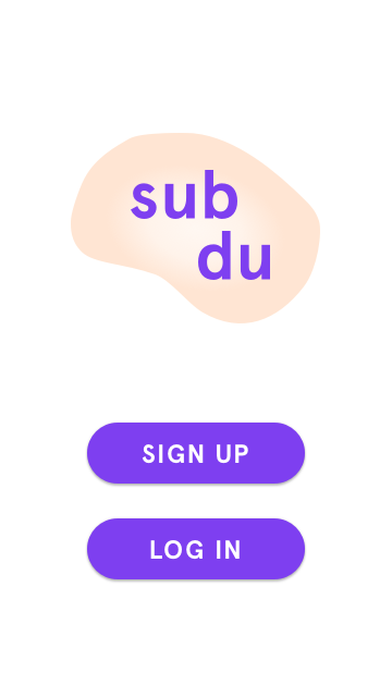
Inspired by Headspace’s UI, I chose Apercu as Sub-du’s font family and opted for a purple (close to the Material Design purple) as the primary brand color to convey a sense of reliability and honesty.
High Fidelity
I implemented the feedback from my first round of usability testing, and treated my low fidelity screens to create high fidelity mockups.
Here are a few:


Based on my testing feedback, there weren’t many modifications to make. The main changes I made from the wireframes were:
- Add a Floating Action Button (FAB) to the Subscriptions page as a more prominent CTA to add a new service
- Naming changes (pages, tabs)
- Added global search and notifications to top nav bar
Validation (High Fidelity)
Now I needed to evaluate my high fidelity designs in action. I wired up another prototype in Marvel and recruited three new participants.
Check out the final prototype:
The structure of this round of testing was very similar to that of Phase 1 testing. I added a few additional hypothetical ("where would you go to do X?") tasks to the test script:
- Locate a service in the catalog on the Subscriptions page
- Sort services chronologically on Subscriptions page
After making the above modifications to address the issues from low fidelity testing, there were no notable usability issues with the high fidelity designs.
Reflections
This was the first experience I had working with a “client” and developing a project plan accounting for budget constraints. It was a bit intimidating to start from scratch and make decisions about how to allocate resources. Once I had an outline in place, the project became much more approachable.
Now that I’d had a few projects under my belt, there wasn’t as much of a learning curve to overcome in carrying out the work. I would say the two biggest challenges with this project were: